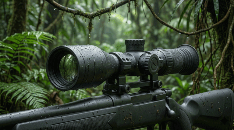
A practical way to cut night-shift eye strain is to design the viewing experience around the thermal imager module, the thermal sensor module, and the thermal image sensor module together—optics, display pipeline, and UI—so operators see more with less effort. Eye fatigue (“asthenopia”) rises when contrast is marginal, luminance is poorly managed, fonts are hard to parse, or the image stream flickers; the good news is that most of these can be fixed with standards-aligned ergonomics rather than new hardware.
Table of Contents
ToggleWhy night viewing tires the eyes
When you stare at a bright, high-contrast scene in a dark room, your visual system spends energy adapting; add micro-jitter, noise, or harsh UI overlays and fatigue accelerates. Ergonomics standards such as ISO 9241-303/307 describe how display quality, luminance management, and legible text affect comfort and performance. In practice, “good” night viewing means stable luminance and contrast, minimal flicker, readable overlays, and restrained UI colors that don’t flare against a dark background. These principles are technology-agnostic and map cleanly to thermal workflows.
1) Shape your brightness curve to the room, not the lab
If the viewing room is dim but your display runs “day” settings, the iris/retina continually adapts and tires quickly. Start by targeting a lower black level and a gentler brightness curve at night, then verify with recognized display patterns. NIST guidance on display set-up and luminance measurement is a solid anchor: calibrate white/black luminance with full-screen fields, then validate that mid-tones aren’t crushed. For thermal, this usually means letting mid-gray occupy more code values so small thermal differences remain visible without blasting the operator.
Practical tip: on a 10-bit pipeline, bias your tone-curve so the knee sits below the high-lights you rarely see at night (e.g., exhaust stacks), and keep mid-tones spread where people and vehicles live. Combine this with restrained UI color to avoid local glare around text (see Tip 4).
2) Use UI color that avoids glare and respects dark adaptation
High-luminance, saturated UI elements create discomfort glare, pulling attention and driving fatigue. The CIE Unified Glare Rating (UGR) framework formalizes how source luminance, background luminance, size, and position affect discomfort; you don’t have to compute UGR in software, but you should design overlays to behave like “low-glare” objects in a dark room. Keep overlays at lower luminance than the hottest parts of the thermal image, avoid pure white, and prefer subtle, desaturated tones with adequate contrast. If you offer a dark mode / light-on-dark UI, ensure text contrast remains high without hard white on black (avoid “halation”).
At night, fewer colors help. Give operators two palettes (e.g., black-hot and white-hot) and one accent color for warnings. Avoid blinking indicators unless safety demands it—temporal contrast adds to strain.
3) Raise refresh and eliminate low-frequency PWM flicker
Flicker at or near the critical fusion frequency is a classic fatigue driver. Many OLED/LCD backlights or panels dim with PWM; if the modulation frequency is low, sensitive viewers experience headaches and strain. IEEE Std 1789-2015 provides recommended practices for mitigating health risks from LED modulation (i.e., “flicker-safe” regions tied to frequency and modulation depth). Where possible, prefer DC dimming at low luminance; if PWM is unavoidable, keep frequency high and modulation depth modest. Also keep the video refresh rate stable end-to-end; irregular frame pacing forces the eye to chase motion.
On gimbals or PTZ views, a stable 50/60 fps can reduce perceived smear on pans and lessen the need for aggressive sharpening (Tip 6), both of which help comfort on long watches.
4) Make fonts and OSD overlays pass the ISO sniff test
Hard-to-read overlays are silent fatigue multipliers. ISO 9241-307/112 cover text legibility: stroke width around 10–17% of character height and balanced width-to-height ratios are commonly referenced, along with general principles for the presentation of information (discriminability, freedom from distraction). In practice, a semi-bold, geometric sans with good x-height and generous letter-spacing reads better at a distance than a thin, decorative face. Add a soft translucent backing plate (not pure black) behind status text so the glyphs don’t shimmer over noise.
Keep font sizes predictable: a consistent hierarchy for target labels, HUD data (time, GPS), and prompts reduces scanning time and micro-saccades.
5) Balance gain, noise filter, then gentle sharpening—in that order
Noise stimulates the visual system even when operators ignore it; you pay for that with fatigue. A modest temporal noise filter reduces speckle first; then tuned gain/AGC spreads mid-tones where operators work; finally, apply restrained sharpening to edge energy that’s truly present. Reversing the order (heavy sharpening on a noisy feed) creates halos/ringing that the brain perceives as “buzz,” especially in dark rooms. This SNR-before-detail logic mirrors measurement practice in display evaluation and yields calmer images that sustain attention longer.
For UAV work, raise bitrate a step on long-range overwatch; compression that over-quantizes low-contrast detail forces the eye to hunt.
6) Stabilize the image and reduce micro-motion
Even sub-pixel sway forces continual accommodation and pursuit. Mechanical stability (solid mounts, tuned gimbals, balanced payloads) protects “one-pixel truth,” preventing the shimmer that turns a 20-minute task into a 2-hour headache. This isn’t only optical—keep frame delivery regular (no jitter), and avoid UI elements that drift or bounce. While ISO 9241 focuses on displays and information presentation, its core principle—reduce distractions and support the task—applies: fewer involuntary eye movements, less fatigue.
7) Manage blue-weighted light late at night without killing legibility
At night, excessive short-wavelength content can be alerting; if your viewing room lighting is adjustable, keep it dim and warm. The CIE S 026 system formalizes metrics (e.g., melanopic EDI) for ipRGC-influenced responses to light; you don’t need to compute these on the UI, but you should allow operators to lower the white point or activate a “night color” preset in the viewer app. Keep contrast and font weight adequate so readability isn’t sacrificed—a warm, low-glare UI beats raw blue suppression.
8) Declutter the scene: present only what aids decisions
Every extra widget consumes attention. ISO 9241-110/112 emphasize suitability for the task, self-descriptiveness, and freedom from distraction—great heuristics for thermal UIs: show only the target box, a single status row, and an unobtrusive recording indicator. If operators repeatedly chase non-actionable prompts, retire them. Provide quick toggles for UI color and brightness curve rather than a crowded menu. Less to parse = less fatigue, especially after midnight.
Implementation patterns (Security vs. UAV)
Security (fixed sites). Put a calibrated monitor in a dim, non-reflective room. Load a night brightness curve that keeps black level low but mid-tones open; run DC backlight dimming if available. Use semi-bold sans overlays with translucent backing, minimal UI color, and no flashing icons. Log settings with ISO 9241-307 test methods so QA can reproduce them after firmware updates.
UAV (air). For pilots, smoother refresh (stable 60 fps) and minimized low-frequency PWM help during pans; use a two-palette scheme and one accent color to avoid glare. Offer a “hover-clarify” preset that bumps bitrate, reduces sharpening halos, and locks brightness curve to stable mid-tones. Keep font sizes large enough to read on a sun-hooded 7–9″ field monitor without squinting.
A simple, standards-aware checklist
- Calibrate white/black with NIST patterns; save “Night-Ops” and “Day-Ops” presets.
- Confirm legible text (stroke width/ratios) and information hierarchy per ISO 9241-112.
- Verify no low-frequency PWM at chosen dim levels; prefer DC dimming; align with IEEE 1789.
- Keep overlays low-glare; follow CIE glare guidance concepts (avoid bright, large sources in the operator’s line of sight).
- Offer a warm “night color” preset; understand circadian-sensitive metrics from CIE S 026 (conceptual reference).
Integration notes for product teams
Because comfort is a system outcome, bake these controls into your product line so every payload behaves the same way on every platform:
- In firmware, expose a brightness curve LUT pair (day/night) and bind to a hotkey.
- Provide three text styles (normal, alert, critical) that meet ISO 9241-112 discriminability principles.
- In the encoder, include a “night bitrate” preset and keep frame pacing steady.
- In the viewer, implement a UI color designer with preview against typical thermal frames (black-hot/white-hot).
- In hardware, specify DC dimming hardware paths where feasible; if PWM is required, commit to frequencies/modulation depths in the IEEE 1789 “low-risk” region.
Internal links (ready to paste)
- Build a configurable payload around our Thermal camera module to standardize optics + UI presets across missions.
- For implementation details (fonts, brightness curve, overlays), see Thermal camera module integration.
- If you need variants per customer, align early via our OEM/ODM Partner Program.
- Want help porting these presets to your gimbal app? Contact our engineering team for a night-ops review.
FAQs
Does dark mode always reduce eye fatigue at night?
Not always. Dark backgrounds lower glare, but text contrast and font weight still need to be high enough for easy reading. Aim for low-glare UI colors with strong legibility rather than pure white on pure black.
Will a higher refresh rate actually help?
Yes. Smoother motion reduces pursuit eye movements and perceived blur. Also ensure your display backlight doesn’t use low-frequency PWM; DC dimming or high-frequency modulation is preferable.
Which font rules improve legibility on thermal UIs?
Use a clean sans serif with good x-height, stroke width around ~10–17% of character height, and generous letter/line spacing. Add a translucent backing plate behind critical OSD text to avoid shimmer over noisy imagery.
Is reducing blue light enough for night shifts?
It helps, but it’s not sufficient. Combine a warmer white point with controlled brightness, low-glare UI colors, and consistent contrast so operators don’t strain to read overlays.
What’s the right order for image processing at long range?
Denoise first (prefer light temporal filtering), then tune gain/AGC, then apply gentle sharpening. Reversing the order tends to amplify noise and increase visual fatigue.
Do I need special settings for UAV vs. fixed security?
Usually yes. UAV views benefit from stable 50/60 fps, restrained sharpening during pans, and a limited palette set. Fixed sites often prioritize a night brightness curve and consistent overlays for analytics and review.
Call to Action
Ready to make night shifts genuinely easier on the eyes without compromising detection? We can package a Night-Ops UI for your thermal imager module line—complete with brightness curves, font presets, UI color themes, and high-frequency refresh/dimming recommendations—so every operator sees a calm, legible picture. Start with our configurable Thermal camera module, review implementation steps in Thermal camera module integration, or go straight to a 30-minute review via Contact. One pass through your current UI and we’ll hand you specific, standards-backed changes for immediate relief.