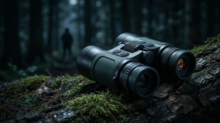
A thermal monocular is not used like a camera. It’s used like a tool.
Table of Contents
ToggleMost users scan while walking, holding other gear, opening gates, using trekking poles, handling a rifle, or managing a dog leash. In those moments, “two-hand operation” becomes friction. Friction becomes frustration. And in dealer channels, frustration becomes returns—because buyers conclude the product is complicated, not premium.
That’s why one-hand UI and quick controls are not feature details. They are sell-through drivers. Dealers can demo a monocular in 30 seconds when controls are intuitive. Dealers struggle when controls require deep menus and confusing long presses. Customers keep the product when the UI feels natural in the dark with gloves. Customers return the product when they feel they must “learn a device” to use it.
This article defines a B2B-first UI framework for thermal monoculars: what to design for fast one-hand scanning, what to keep out of the front layer, how to structure quick controls so dealers can teach them, and how to prevent firmware drift from turning your UI into a moving target. It follows the selection logic from Thermal Monocular Selection Playbook for B2B and connects directly to expectation management from Thermal Monocular Range Claims That Hold Up. For category context, see Thermal Monoculars.
Why monocular UI is judged in seconds
A dealer demo of a monocular is fast. The customer picks it up, looks through it, and immediately tries a few things: brightness, palette, zoom, and maybe recording. If they can’t do those actions quickly, they label the product “complicated.”
That label is damaging because thermal monoculars are often an entry point into the category. First-time users do not want complex. They want “I can use this tonight.”
So a B2B monocular UI should be designed around one truth: the first minute must feel effortless. If it does, conversion improves and return disputes decline. If it doesn’t, your product competes on price because the channel can’t sell confidence.
One-hand UI is not only about buttons; it’s about state clarity
One-hand operation fails when the user is forced to think too much. And thinking happens when the system state is unclear.
Users need to know, without navigating menus:
What palette is active.
Whether they are zoomed and by how much.
What enhancement mode is active (if applicable).
Whether recording is on.
Whether Wi-Fi or hotspot is on (because it impacts battery and sometimes stability).
Whether the device is in standby or active.
If state is not visible, users “tap around” to find it. Tap-around behavior creates accidental changes. Accidental changes create frustration and support tickets.
So a monocular UI should provide minimal but clear on-screen indicators. Not clutter—clarity.
Design around the five high-frequency scanning actions
A monocular used for scanning has a small set of actions that matter disproportionately. Your quick controls should be designed around these:
Power/wake behavior.
Palette switching.
Brightness control.
Zoom behavior (if included).
NUC behavior (manual or auto policy).
Everything else—advanced menus, deep image tuning, file management—should be one layer deeper. Not because they aren’t valuable, but because putting them in the front layer slows the user and increases mistakes.
A useful internal test is: can a first-time user perform these five actions by feel, in the dark, within one minute? If not, your one-hand UI isn’t mature enough for dealer channels.
Quick controls must be “learnable by touch”
Thermal monoculars are often used with gloves and in low light. That means control mapping should be tactile.
Buttons should be distinguishable without looking. A rocker should feel different from a menu button. A power button should be protected against accidental press. The control layout should allow the user to stabilize the monocular with the same hand while changing a setting with a thumb.
Long-press combinations can work, but only if they are consistent and limited. Too many long-press functions create confusion because the user can’t remember them. Confusion becomes “this thing is annoying.”
For B2B programs, a smaller, more consistent control set usually wins against a bigger “feature-rich” control map.
Boot vs standby: the fastest win for one-hand experience
One of the biggest determinants of perceived quality in a monocular is time-to-usable image.
If the monocular must boot from cold start frequently, users feel it is slow. If the monocular supports standby with a fast wake, the product feels ready. That feeling matters because scanning is often opportunistic: the user sees movement and wants to check quickly.
But standby only works when it’s predictable. Users must trust that standby won’t drain the battery unexpectedly and that waking doesn’t cause weird state resets. A B2B program should define boot-to-image and wake-to-image expectations explicitly and test them under realistic conditions (cold, battery mid-level, after long-run operation).
Dealers also care because fast wake makes demos smooth.
Palette switching: speed matters more than variety
Most buyers use a few palettes. They want to switch quickly based on conditions. Too many palettes can actually slow scanning because users get stuck in options.
A B2B monocular should either offer a small, high-utility palette list or provide a “favorites loop” so users can cycle through a short set quickly. This is one of the simplest UI design choices that reduces frustration.
Palette switching should also be stable across firmware versions. If an update changes palette order or the behavior of switching, dealer training becomes invalid. That creates support load.
Zoom controls: avoid encouraging “false range confidence”
Digital zoom is a common reason monocular buyers misjudge range capability. Users zoom in, see noise and blur, and conclude the monocular is weak. Or they zoom in and believe the image equals identification confidence, then feel disappointed later.
Your UI should guide zoom use within a comfort envelope. That can be done through step design (reasonable increments), through on-screen magnification display, and through dealer scripts that set expectations.
This connects directly to the range-claim discipline in Thermal Monocular Range Claims That Hold Up. UI and range claims must reinforce each other, not fight each other.
NUC control: make it predictable, not mysterious
Users interpret unpredictable NUC events as bugs.
A monocular UI should clearly communicate when a NUC event is happening, and ideally allow manual control. Auto-NUC can be acceptable if it’s not intrusive and if it follows a predictable policy, but many scanning users prefer manual NUC so they can do it when they choose, not when the device decides.
The key B2B point is consistency. If NUC policy differs across batches or firmware versions, dealers will see “this unit feels different” complaints. Those complaints are hard to resolve without version discipline.
So NUC policy should be treated as part of product identity, not as an engineering tweak.
Recording and Wi-Fi: keep them from polluting the scanning workflow
Recording is valuable, but it should not slow scanning. Wi-Fi is convenient, but it often increases battery drain and can introduce instability if the system isn’t designed well.
A B2B monocular UI should keep these features accessible but not intrusive:
Recording start/stop should be one action, with a clear indicator.
Wi-Fi should have a clear on/off status and ideally a quick toggle path, but it should not be easy to enable accidentally.
File review should be separate from scanning mode; the user shouldn’t fall into playback while scanning.
These small UI choices reduce frustration and dealer support calls.
One RFQ-ready one-hand UI checklist
Below is the only table in this article. It translates one-hand UI into requirements you can verify during samples and pilot runs, without turning UI into subjective debate.
| One-hand UI area | Requirement style that is verifiable | Quick verification method |
|---|---|---|
| Boot-to-image | max time to usable image | timed cold start test |
| Wake-to-image | max time from standby | repeated wake cycles |
| Palette switching | ≤N steps, favorites loop optional | timed palette cycle demo |
| Brightness control | quick access, glove usable | glove test + no-look operation |
| Zoom control | clear magnification indicator | step zoom and confirm display |
| NUC control | manual option + clear indicator | trigger NUC and observe behavior |
| Recording | one-step start/stop + indicator | record 1–2 min, verify file |
| Wi-Fi | clear status + hard to enable accidentally | toggle test + battery drain note |
| State clarity | visible key indicators without clutter | dealer demo script check |
| Control consistency | mapping stable across screens | test actions in multiple UI states |
This table forces suppliers to design for reality: scanning happens fast, often one-handed, and often with gloves.
Validation: test UI under the same constraints dealers face
UI validation should not happen only in an office. It should happen in dealer-like conditions:
Low light.
Cold hands or gloves.
Walking while scanning.
Quick palette and brightness changes.
Short recording actions.
Standby/wake cycles.
In practice, you don’t need a huge test team. You need a small set of representative users and a scripted set of actions. The outcome is not a design award; it’s a reduction in returns and support burden.
If your product passes these validation conditions, dealers will demo confidently and customers will feel “this is easy.”
Firmware drift: the silent killer of dealer training
Even a great UI can become a problem if it drifts.
If the next firmware changes button mapping, changes palette order, changes NUC behavior, or changes standby behavior, your dealer training becomes wrong overnight. Dealers don’t like updating their training scripts constantly. When they get burned, they stop pushing the product.
So B2B monocular programs should require version visibility and release discipline: mode mapping and high-frequency controls should be treated as “stable UI contracts.” Improvements can happen, but they should be released intentionally with clear notes and regression tests.
This is part of why process discipline matters. Your public materials can stay simple, but your internal program must treat UI identity as controlled.
FAQ
What is the biggest UI mistake in thermal monoculars?
Burying high-frequency actions in menus. Palette, brightness, and NUC control must be quick and learnable by touch, or the monocular feels complicated and returns increase.
Do more buttons make one-hand control better?
Not automatically. More buttons can improve direct access, but they can also increase accidental presses and confusion. The best designs keep a small number of high-confidence controls and stable mapping.
Should monoculars rely on auto-NUC or manual NUC?
Manual control is often preferred for scanning because it gives users control over interruption. Auto-NUC can work if it’s predictable and not intrusive. The key is stable policy and clear indicator.
How do I reduce “this feels slow” complaints?
Define and test boot-to-image and wake-to-image targets. Standby is usually a major win if battery behavior and state retention are predictable.
How should dealers demo a monocular UI?
Use a 30–60 second script: boot/wake → palette switch → brightness → zoom step → NUC explanation → optional recording. If the demo is smooth, conversion increases and returns decline.
Call to action
If you share your target user segment (hunting scan, patrol, wildlife) and your preferred control philosophy (few buttons vs more direct access), we can translate this into an OEM UI appendix and a dealer demo script that locks one-hand behavior and prevents drift.
For program discussions, use CONTACT.
Related posts
- Thermal Monocular Selection Playbook for B2B
- Thermal Monocular Range Claims That Hold Up
- Thermal Monocular One-Hand UI and Quick Controls
- Thermal Monocular Battery Strategy and Runtime Truth
- Thermal Monocular IP Rating and Real-World Durability
- Thermal Monocular RFQ and Acceptance Checklist