In outdoor thermal optics, hardware gets you on the shortlist. UI/UX wins the repeat orders.
For hunting brands and distributors, the user interface is not just “menus and icons.” It is the system that determines whether a customer can operate the device correctly under stress, in the dark, with gloves, in cold weather, while tracking moving targets.
Table of Contents
ToggleThat matters commercially for three reasons:
First, a strong UI reduces returns. Many returns are not “bad hardware,” but confusion, misconfiguration, and frustration (wrong zeroing steps, hidden modes, accidental button presses, unclear status icons). Second, UI is where brands differentiate when competitors share similar sensors and optics. Third, UI directly influences word-of-mouth: customers remember whether the product felt intuitive at 1 a.m. in a field, not whether the spec sheet said “640.”
This guide explains how to customize UI for hunting brands across thermal scopes, monoculars, and clip-ons, with a focus on three areas that matter most in OEM/ODM programs:
- Menu logic customization (task-first structure, fast access, low mistakes)
- Multi-language and regionalization (translation, units, typography, market fit)
- Button layout and interaction design (glove-friendly controls, short/long press mapping)
It’s written for B2B buyers who want a UI that feels “brand-grade,” not generic.
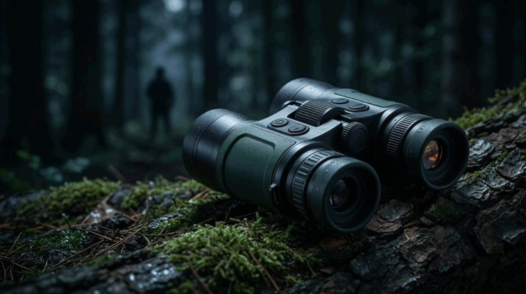
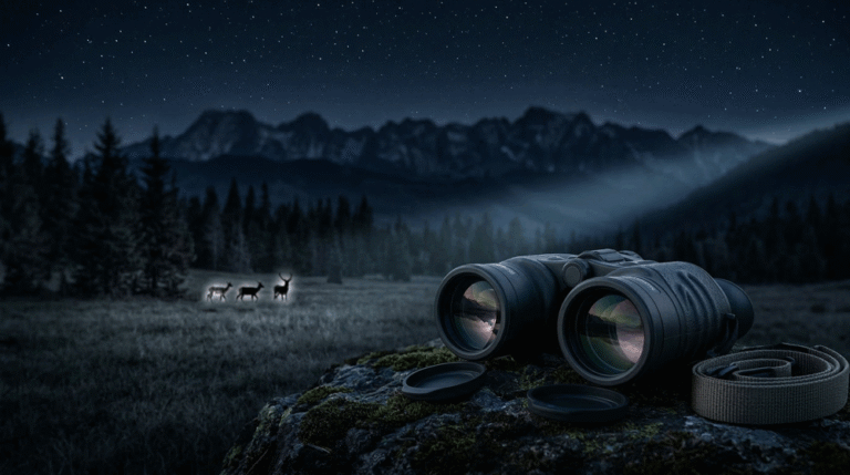
1) The Reality of Field Use: Why Hunting UI Is Different
Most consumer electronics UI is designed for bright screens, quiet environments, and two hands. Hunting UI is designed for the opposite. Users operate thermal devices:
- with one hand or awkward grip positions
- in darkness, often avoiding bright screen flashes
- wearing gloves (reduced tactile sensitivity)
- while moving, scanning, and tracking
- under time pressure (targets appear briefly)
- in cold weather (slower reactions, thicker clothing)
The UI must also support core hunting tasks that are not common in other device categories: reticle selection, zeroing workflows, ballistic inputs (if applicable), fast mode switching, NUC behavior awareness, recording confirmation without distraction, and rangefinding overlays.
A UI that looks clean in an office can be a disaster in a wet field. “Simple” is not minimal. In hunting, “simple” means fast, forgiving, and predictable.
2) UI as a Product Feature: The Brand Premium You Can Actually Control
Brands often try to differentiate with new hardware features. That’s expensive and slow. UI is a faster lever.
A well-designed UI creates premium perception through:
- clear mental model (users always know “where they are”)
- consistent button behavior (short press vs long press predictable)
- reduced cognitive load (fewer decisions during the hunt)
- faster “time-to-action” (distance → decision → shot)
- fewer interrupts (NUC and warnings handled gracefully)
This is why many successful hunting brands treat UI like a long-term asset: it evolves through versions, becomes familiar to users, and increases switching cost. A brand-grade UI turns a device into an ecosystem.
3) A “Task-First” Framework for Menu Logic
The best hunting UI starts by mapping field tasks to the fewest possible steps. Instead of organizing menus by engineering categories (“Image,” “System,” “Tools”), organize around what users do:
- Acquire target (scan, zoom, adjust contrast)
- Identify (fine tune image, palette, sharpness)
- Engage (reticle/zero, range, ballistic if available)
- Record/share (start/stop recording, quick playback)
- Maintain readiness (battery, calibration, storage, brightness)
A useful method in OEM programs is to define a Tier 1 Action Layer and a Settings Layer.
- Tier 1: actions users need in seconds, repeatedly, in the field
- Settings: configuration users can do before the hunt or after the hunt
If too many field tasks are buried in settings, the UI becomes slow and frustrating. If too many settings are exposed as quick actions, the UI becomes chaotic and mistake-prone.
A practical “task-to-access” map
Use a simple map to guide menu design and button mapping:
| Task Type | Examples | Ideal Access |
|---|---|---|
| Instant field actions | zoom, palette, brightness, rangefind (LRF), record | button shortcut / quick menu |
| Frequent adjustments | contrast, sharpness, scene mode | quick menu (1–2 levels) |
| Occasional configuration | Wi-Fi, language, units, date/time | settings layer |
| Rare maintenance | factory reset, advanced calibration | deep settings + confirmation |
This keeps the UI “field-fast” without making it unsafe.
4) Designing the Quick Menu: The Most Important Screen in Hunting
If you only improve one UI element, improve the quick menu. In hunting optics, quick menu is the “cockpit.” It should allow common adjustments without breaking scanning flow.
A strong quick menu has three characteristics:
It is consistent across product types. If a brand sells monoculars and scopes, users should not have to relearn everything.
It avoids clutter. Only put high-frequency adjustments in quick menu. Keep it to one page if possible.
It provides immediate feedback. Users must see the effect of a change instantly (brightness change, palette change), without additional confirmation dialogs.
For OEM projects, it’s useful to define a “standard quick menu set” for the brand and keep it consistent across SKUs. That creates brand identity and reduces support burden.
5) Reducing Mistakes: Preventing “Field Errors” Through UI Design
Many problems in hunting thermal optics come from errors that happen in the field. Good UI reduces the chance of these errors.
Common field errors include:
- accidental recording when trying to zoom
- switching palettes accidentally and losing the target momentarily
- triggering NUC at the wrong time because the user doesn’t understand it
- selecting wrong unit (meters/yards) or wrong reticle profile
- entering a deep menu and losing situational awareness
A mistake-resistant UI uses these techniques:
Clear separation between actions and settings. Recording should be a distinct action, not buried among image settings.
Two-step confirmation for destructive actions only. Don’t confirm everything. Confirm only what can damage data or configuration (format storage, reset, delete profile).
Context-aware guidance. If users enter a zeroing workflow, the UI should guide them step-by-step and clearly indicate completion.
Persistent status indicators. Battery, recording status, Wi-Fi status, and calibration readiness should be visible but not distracting.
The goal is to protect users from themselves without slowing them down.
6) Multi-Language Support: More Than Translation
Multi-language is often treated as “translate strings.” For hunting brands, it’s a positioning and market-access requirement. It also affects perceived quality immediately.
A professional localization plan includes:
6.1 Language, Typography, and Text Expansion
Different languages expand differently. German text is longer. French uses more characters. Some languages require special character support. If you simply translate without UI layout planning, you get truncated menus, broken alignment, and unprofessional visuals.
OEM/ODM UI customization should include:
- font selection that supports target languages
- layout rules for longer strings
- consistent capitalization and style
- readable text at night (font weight and spacing matter)
6.2 Units and Region Preferences
Hunting users care about units. US users prefer yards. Most other markets use meters. Temperature, time format, and even naming conventions matter.
A brand-grade UI supports:
- meters/yards toggle
- °C/°F toggle where relevant
- 12/24-hour time toggle
- region-based defaults per SKU or per firmware build
6.3 Compliance and Safety Text
Some markets require specific warnings, laser labeling notices (if LRF), battery safety notes, or RF statements. Even when not legally required on-screen, clear and correct safety text improves trust and reduces support cases.
Localization checklist table (for OEM programs)
| Localization Item | Why It Matters | Common Failure |
|---|---|---|
| Font support & rendering | avoids broken characters | “□□□” boxes in menus |
| Text expansion handling | prevents truncation | cut-off critical options |
| Units & defaults | matches market habits | wrong range units in US |
| Translation style guide | consistent brand tone | inconsistent terms confuse users |
| Regional quick-start guide | reduces support calls | users misconfigure basics |
Localization is a high-leverage quality signal. Buyers forgive missing features more than they forgive sloppy language.
7) Button Layout and Interaction: Where Most Field Friction Comes From
Hunting UI is not just on-screen. It’s physical. Buttons are part of the UX system.
Good button design solves these field realities:
- gloves reduce tactile precision
- users operate by feel, not by sight
- repeated actions must be easy (zoom, palette, record)
- accidental presses must be minimized
- left-handed and right-handed use should be considered
7.1 Short Press vs Long Press: A Controlled Language
One of the most effective ways to expand capability without adding buttons is consistent short/long press logic. The mistake is making it random.
A clean rule set might look like:
- short press: immediate action (zoom step, palette toggle)
- long press: enter/exit quick menu, start/stop recording, lock screen
- double press: reserved only for high-value actions (e.g., NUC on demand) and used sparingly
Consistency matters more than cleverness. Users learn muscle memory. Muscle memory sells.
7.2 Button Priority: What Should Be “Dedicated”
For hunting optics, certain functions often deserve dedicated access:
- zoom control (or a zoom + quick menu combination)
- palette toggle (for fast target separation)
- record (if your brand positions recording as important)
- LRF trigger (if integrated)
If too many functions compete for the same button, mis-presses increase. If too few functions are accessible, the UI becomes slow and users blame the product.
7.3 Physical Design: Spacing, Tactility, and Placement
Key requirements include:
- enough spacing to avoid “fat finger” errors with gloves
- distinct tactile shapes (raised, concave/convex)
- placement where the natural grip rests
- avoidance of side placement that causes accidental presses while mounting or scanning
For scopes, consider how the user interacts while the scope is mounted. For monoculars, consider one-handed scanning. For clip-ons, consider that users may operate while also managing a day optic and mount system.
8) Scope vs Monocular vs Clip-on: UI Must Respect the Workflow
Even if you share a platform UI, each product category has different moments of stress.
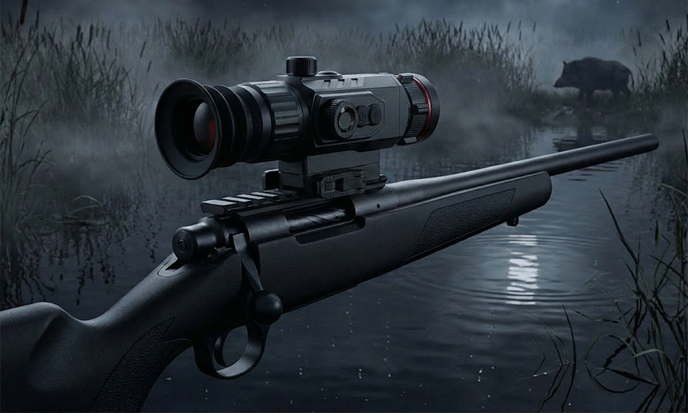
Thermal scopes need:
- fast reticle selection and brightness tuning
- a zeroing workflow that is nearly impossible to misunderstand
- recoil-safe “lock modes” to avoid accidental changes
- quick access to range/ballistic functions where used
Monoculars prioritize:
- scanning comfort (smooth zoom, quick palette changes, minimal interruptions)
- one-handed operation logic
- recording workflows that don’t disturb scanning
Clip-ons need:
- minimal impact on day optic workflow
- reliable mode switching without confusing overlays
- alignment/calibration support if required, without clutter
A brand-grade OEM program typically uses a shared UI foundation but customizes category-specific quick menus and button mappings.
9) Validation: How to Prove UI Is Field-Usable (Not Just “Looks Nice”)
UI should be validated like hardware: with real users in real environments.
The best validation method is simple: time-to-task testing with hunters or field testers. Measure:
- how long it takes to change key settings while scanning
- how often users make accidental presses
- how often users get “lost” in menus
- whether users understand status indicators without training
Also validate in the conditions that cause UI failure:
- with gloves
- in darkness (screen brightness, text readability)
- under stress (moving target scenarios)
- during cold weather (slower fingers, thicker gloves)
A good UI reduces training burden. That directly reduces dealer support time and return rates.
10) OEM/ODM Customization Deliverables: What to Request (So You Actually Get What You Want)
In OEM projects, UI customization can collapse into vague requests like “make it more user-friendly.” That leads to endless revisions and disappointment. Instead, define deliverables clearly:
You want:
- a menu tree specification (what goes where and why)
- a quick-menu spec (fixed set of field actions)
- button mapping spec (short/long press behavior)
- language pack plan (supported languages + typography rules)
- version control and release notes discipline
A practical way to manage UI is to treat it as a product requirement document, not an afterthought.
Conclusion: UI Is the Fastest Way to Make a Thermal Platform Feel Like Your Brand
In competitive outdoor thermal optics, UI/UX is where brands win without paying the full cost of reinventing hardware. A well-designed interface improves field usability, reduces mistakes, lowers returns, and builds customer loyalty. Menu logic should follow hunting tasks, not engineering categories. Multi-language support should be professional, not a rushed translation. Button mapping should be consistent, glove-friendly, and designed for muscle memory.
If your brand wants to feel premium, the UI must behave premium.
CTA: Want a Brand-Grade Hunting UI on Your Next Thermal Product Line?
If you’re developing thermal scopes, monoculars, or clip-ons for hunting markets and want a UI that feels intuitive in real field conditions, we can support OEM/ODM UI customization across menu logic, multi-language packs, and button layout optimization.
Share these details via your website inquiry form:
- Product category (scope / monocular / clip-on)
- Target markets and languages (US/EU/AU, required languages)
- Key field priorities (fast scanning, LRF/ballistics workflow, recording)
- Preferred control style (minimal buttons vs dedicated keys)
- Target tier (entry premium / premium-value / flagship)
You’ll receive a recommended UI architecture (menu tree + quick menu), button mapping proposal, localization checklist, and a validation plan designed to reduce field errors and improve dealer confidence.
Recommended Reading for OEM Buyers