A thermal clip-on is a “stacked workflow” product. The user is not only operating the clip-on—they are operating the day scope, the rifle, and their own shooting process at the same time. That makes UI a commercial issue, not a cosmetic issue.
Table of Contents
ToggleClip-ons are often purchased for one promise: keep the day optic experience and “add thermal” without friction. If the UI forces deep menus, slow boot sequences, confusing mode changes, or unpredictable calibration/NUC behavior, the promise breaks. When the promise breaks, the channel sees the consequences immediately: dealers struggle to demo quickly, customers feel the product is finicky, and returns show up as “not as expected” even when the hardware is fine.
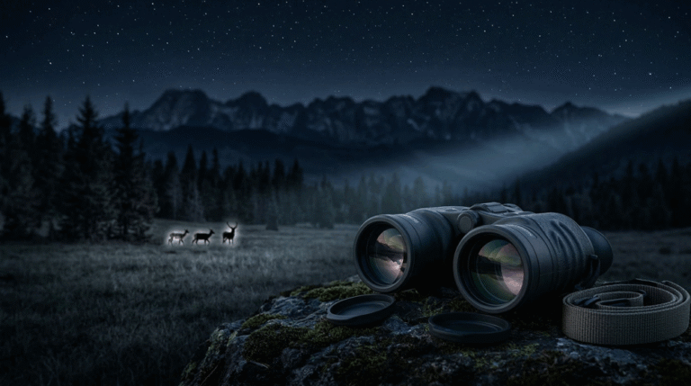
Fast mode switching is where clip-on UI is tested hardest. Users want to move quickly between modes (white hot/black hot, different palettes, different enhancement levels, standby vs run, recording on/off) without losing the target or breaking rhythm. If mode switching feels slow or inconsistent, a clip-on becomes frustrating in real hunts and in dealer demos.
This article defines practical UI requirements for thermal clip-ons with one objective: fast, predictable mode switching that supports dealer demonstrations and real hunting workflows. It is designed to work with Series A’s POI-driven foundation, Thermal Clip-On OEM Spec and POI Control. It also assumes your mounting and compatibility boundaries are controlled, because UI cannot fix POI issues caused by ring fit or day scope pairing—those are addressed in Thermal Clip-On Mounting Rings and Fit Consistency and Thermal Clip-On Day Scope Compatibility and Parallax. For product overview context, see Thermal Clip-On Sight.
Why clip-on UI is different from riflescope UI
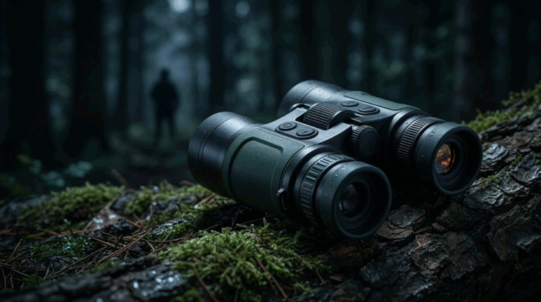
A dedicated thermal riflescope can afford more UI complexity because the user commits to that scope as the primary aiming system. A clip-on can’t. The clip-on is a temporary layer. It must stay out of the way.
In practical terms, that means the clip-on UI should obey a different rule set:
It should minimize time-to-usable image. It should minimize cognitive load. It should minimize steps for high-frequency actions. It should avoid UI behaviors that create uncertainty during a shot opportunity. And it should remain consistent across firmware versions, because dealers train workflows and customers copy workflows from videos.
This is why “fast mode switching” is not a feature request. It is a category requirement. If your clip-on behaves like a complex gadget, the market will punish it.
What “fast mode switching” actually means in the field
Fast switching is not only “the button works.” It is the combined experience of input, system response, and state clarity.
Input means the control mapping is learnable by touch. If the user must look away from the day scope image to find a button, the switching isn’t field-fast.
System response means the image changes quickly and predictably without freezing at the wrong time or introducing a long latency that breaks target tracking.
State clarity means the user knows what mode they are in without guessing. In a clip-on, guessing is costly because the user’s attention is already split between the day scope reticle, the scene, and the shot process.
So the B2B requirement is not “supports palettes.” It is “supports switching palettes quickly and predictably, with clear state indication.”
This difference is exactly why many “feature-rich” clip-ons still feel worse than simpler models. The simpler model may be designed around state clarity and low friction.
Design the UI around the five clip-on high-frequency actions
Clip-on UI should be written around the actions that users perform repeatedly in a hunt and that dealers must demonstrate quickly.
Those actions are typically: power/wake behavior, palette switching, enhancement switching, zoom behavior (if present), and NUC control. Recording is also important, but it should not compromise these core actions.
Everything else is secondary and should be kept out of the “front layer” of the UI.
A practical brand goal is that a dealer can demonstrate these actions in under one minute without opening a deep menu. If you cannot do that, your demo will be slow, your close rate will drop, and your returns will rise because customers feel the product is harder than expected.
Boot and standby: the first UI experience is a trust cue
In clip-ons, boot behavior is a trust cue. A slow or uncertain boot feels unprofessional. It also creates a functional problem: users want to be ready quickly when a target appears.
That is why many successful clip-on programs rely on predictable standby behavior rather than forcing full boots repeatedly. But standby is only valuable when it is safe and predictable: wake-to-image must be fast, the device must not lose its state unexpectedly, and battery behavior must be transparent enough that users don’t fear being “caught dead.”
A B2B OEM spec should therefore define boot-to-image and wake-to-image behaviors explicitly, with testable time expectations under defined conditions. It should also define what happens when the battery is low, because “surprise shutdown” is one of the fastest ways to turn a premium product into a negative story.
Palette switching: make it fast, not fancy
Most customers use a small set of palettes. They want the ones that help in their conditions, and they want to switch quickly.
A clip-on UI that offers too many palettes can actually slow users down. The system feels complicated, and the user ends up hunting through options when they should be hunting targets.
That is why your UI requirements should prioritize a small, high-utility palette set and a fast switching mechanism. If you include many palettes, you should still allow users to define a “favorites loop” so switching remains fast. Dealers also prefer this because they can demo a small set without confusion.
The commercial point is simple: the channel sells what it can explain. Palette overload is not a selling point if it increases friction.
Enhancement and noise reduction: keep it stable and predictable
Enhancement modes are often where clip-on UI becomes inconsistent across batches and firmware versions. Engineers tune enhancement to make demos look good. Then they adjust for different environments. The product identity drifts.
In a clip-on, identity drift is especially dangerous because users compare the thermal overlay to their familiar day scope experience. Any sudden changes in edge behavior, smoothing, or contrast mapping feel “weird.”
That is why enhancement control should be designed around two things: predictable effect and stable default. If users can flip between two or three well-defined enhancement levels quickly, they feel in control. If the system has many obscure enhancement combinations, the user feels uncertainty.
This is also where governance matters. Mode behavior must not change silently. If your clip-on has firmware that evolves, the UI and mode mapping must remain stable or change through controlled release notes. Otherwise, dealer training becomes invalid and returns increase.
NUC control: make it a policy the user can trust
NUC (Non-Uniformity Correction) is the most visible “system event” in many thermal devices. In clip-ons, it is even more visible because the user is looking through a day scope and any interruption feels like a break in the shot rhythm.
If NUC triggers unpredictably or too frequently, users call the product “buggy.” If the UI offers no clear control, users feel powerless. If NUC interrupts recording or causes instability, trust collapses quickly.
Your clip-on UI requirements should therefore define NUC policy in plain language: whether auto-NUC exists, whether manual NUC exists, how manual NUC is triggered, what the user sees during NUC, and how NUC interacts with recording and standby.
This is not over-specifying. It is preventing the most common negative user story.
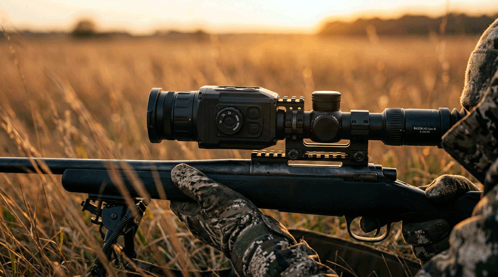
Button mapping and tactile logic: UI is physical in clip-ons
Clip-ons are used in darkness, often with gloves, and often under time pressure. That means button mapping and tactile differentiation matter more than menu design aesthetics.
If the user cannot operate palette switching and NUC control by feel, the UI is not field-ready. If the user must remember complex long-press patterns, the UI becomes fragile in real use. If the button mapping changes across firmware versions, training collapses.
A practical B2B standard is that high-frequency actions should be mapped to short, consistent interactions and should work the same way regardless of what screen is displayed. The user should not have to remember “in this menu, long press means X, but in another menu it means Y.” That inconsistency is a return generator.
State indicators: clip-ons must prevent “mode uncertainty”
Mode uncertainty is a silent source of dissatisfaction. If a user is not sure whether they are in standby, whether recording is active, whether enhancement is set to a certain level, or whether the device is in a specific NUC mode, the user’s confidence drops. In hunting, confidence is everything.
Clip-on UI should therefore provide minimal but clear indicators: an icon or small text that signals palette, enhancement level, recording status, battery state, and NUC mode. These indicators should not clutter the view, but they should be unambiguous.
Dealers benefit from this too. A dealer demo becomes smoother when the salesperson can say, “Here’s the palette, here’s recording, here’s standby,” and the customer can see it instantly.
One practical UI requirement set for RFQ and acceptance
The easiest way to keep clip-on UI disciplined is to write UI requirements as constraints on high-frequency actions and state clarity. That makes the requirements testable and avoids long feature lists.
This is the only table in this article. It’s written as a minimal UI requirement set you can paste into an RFQ appendix and verify during samples and pilot runs.
| Clip-on UI area | Requirement style that is verifiable | How you verify quickly |
|---|---|---|
| Boot-to-image | max time to usable thermal image | stopwatch test across units |
| Wake-to-image | max time from standby to usable image | repeated wake cycles |
| Palette switching | max steps and predictable response | demo script with timed switching |
| Enhancement switching | small set or favorites loop; stable defaults | repeat switching under same scene |
| NUC policy | clear auto/manual behavior + indicator | observe triggers and manual control |
| Recording interaction | switching and NUC must not corrupt files | short stress cycles + playback check |
| Button mapping | high-frequency actions by feel | glove test + no-look operation |
| State clarity | visible indicators for key states | dealer demo check |
| Version stability | mode mapping consistent across releases | release note requirement + regression check |
This table forces discipline without bloating the RFQ. It also supports acceptance: you can verify these behaviors quickly without advanced equipment.
Validation: test UI under real clip-on handling, not in a lab chair
UI problems often look fine at a desk and fail in the field. Clip-ons should be validated under clip-on conditions: low light, gloves, time pressure, switching while tracking a moving target, quick standby cycles, and operation after the device warms up.
You should also validate UI behavior through the day scope at realistic magnifications. Some overlays and indicators look fine in a direct view but feel cluttered or confusing when seen through a day optic.
This is why UI validation should be treated as part of the overall clip-on acceptance system that also includes POI testing and compatibility validation. A clip-on is only “good” when all three are coherent.
Dealer implications: UI is a demo product
Clip-ons are sold by demonstration more than by specification. If the UI is slow, confusing, or inconsistent, the dealer demo becomes awkward. Awkward demos reduce conversion. Low conversion increases discount pressure. Discount pressure breaks channel discipline.
A well-designed clip-on UI does the opposite: it makes the demo feel effortless. The dealer can show the experience, the customer feels confident, and the sale becomes about trust rather than about arguing over numbers.
That is why UI requirements are not a luxury. They are a channel strategy.
FAQ
Why is clip-on UI more sensitive than riflescope UI?
Because clip-ons are used as a layer on top of a day scope workflow. Users want minimal friction and fast switching while maintaining situational awareness and shot rhythm.
What is the most important UI capability for clip-ons?
Fast, predictable switching of high-frequency modes: palette, enhancement, standby, and NUC control, with clear state indication.
Do more palettes and more modes help sales?
Not if they slow switching and increase confusion. Dealers prefer fewer, high-utility options that are easy to demo and easy to teach.
Why do users complain about NUC more in clip-ons?
Because NUC interruptions are more obvious through a day scope, and they can break shot rhythm. Unpredictable NUC triggers create a “buggy” perception.
How can I verify UI quality during OEM samples?
Use a scripted demo under realistic conditions: timed switching, glove operation, standby cycles, and short recording/NUC stress tests. UI should be verifiable, not subjective.
Call to action
If you share your target customer segment and what you want the clip-on to feel like in a dealer demo, we can convert this into a supplier-ready UI appendix: button mapping philosophy, mode set and favorites loop design, boot/wake targets, and a simple verification script that prevents firmware-driven drift.
Use Contact to share your clip-on program scope. For product context, start from Thermal Clip-On Sight.
Related posts
- Thermal Clip-On OEM Spec and POI Control
- Thermal Clip-On Mounting Rings and Fit Consistency
- Thermal Clip-On Day Scope Compatibility and Parallax
- Thermal Clip-On POI Shift Test and Acceptance
- Thermal Clip-On UI for Fast Mode Switching
- Thermal Clip-On Dealer Stock and Demo Program